The Week the Fed Changed the Subject
Everyone got the relief rally they wanted. Then the Fed cracked it on Wednesday. On Thursday, we saw biggest liquidity event year-to-date and smart money flashed its hand.


For two days this week, the market got exactly the story it had been hoping for.
The US and Iran signed a memorandum of understanding. The Strait of Hormuz was set to reopen, oil kept sliding, and the thing everyone had spent a month worrying about simply…stopped being scary. Stocks did what stocks do when a fear evaporates — they drifted higher. Monday and Tuesday were calm and green. By Tuesday’s close, the share of big and mid-cap stocks trading above the prices where institutions are heavily positioned sat at a comfortable 62.7%. Healthy. Relaxed. Nothing to see here.
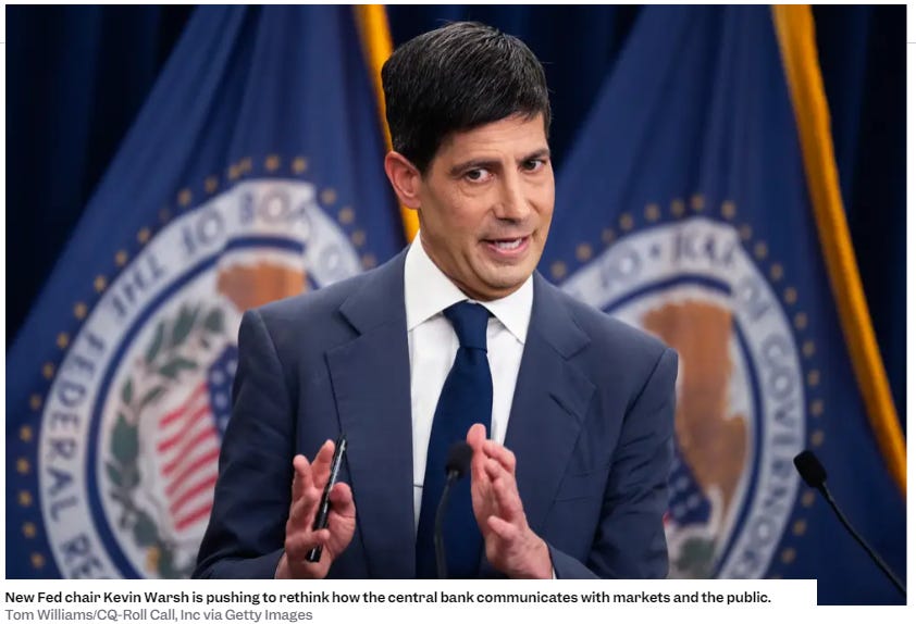
Then Wednesday afternoon, the new Fed Chair sat down at a microphone, and the market remembered it had a different problem.
The thing everyone already knows
Let’s get the shared headline out of the way, because you’ve read it everywhere.
Kevin Warsh, in his first meeting as Fed Chair, held rates steady — which everyone expected — and then delivered what the strategists are politely calling a “hawkish pause.” The Fed’s own projections quietly deleted the rate cut they’d been dangling since March. Nine of eighteen officials now pencil in at least one rate hike this year. Inflation forecasts went up. And Warsh, asked about forward guidance, basically said he didn’t believe in it anymore.
The market did the math in about ninety seconds. Short-term Treasury yields jumped, the two-year hit its highest level in more than a year, and the relief rally that had been coasting on cheap oil suddenly had to reckon with rates staying higher for longer. Stocks sold off Wednesday afternoon, steadied Thursday, and went home for the long Juneteenth weekend a little more sober than they’d arrived.
To be fair, not everyone reads this benignly. The more cautious crowd points out that June is historically a mean-reverting “digestion” month, that the S&P is already carving lower highs and lower lows with momentum quietly diverging from price, and that a break of support could put 7,000 back on the table. I don’t lead with that view, but we can’t pretend the bullish read is the only one on the table — it isn’t.
That’s the version everyone has. It’s true, it’s tidy, and it’s not where the interesting part is. The interesting part is what the sell-off was made of — and that’s where I can show you something nobody else can.
The week had a shape, and the shape is the story
Here’s the picture most people never get to see, because most people start with a ticker and try to back into a thesis that gives them a reason to trade it; I start with a top-down approach to determine if risk is getting paid, distill it into the sectors where that is true and then lastly identify the individual names that are the best expression of risk. Right now, the week ended with a bit of indecision:
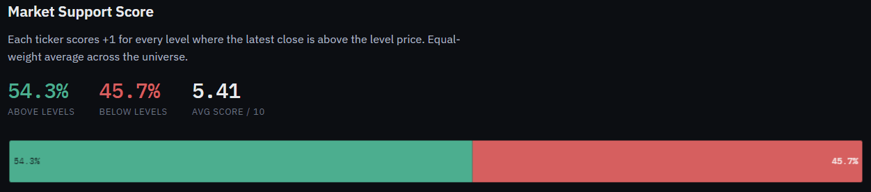
Roughly 54% of names representing 90%+ of the the stock market capitalization closed above institutional positioning. The progression through the week shows how we ended up here:
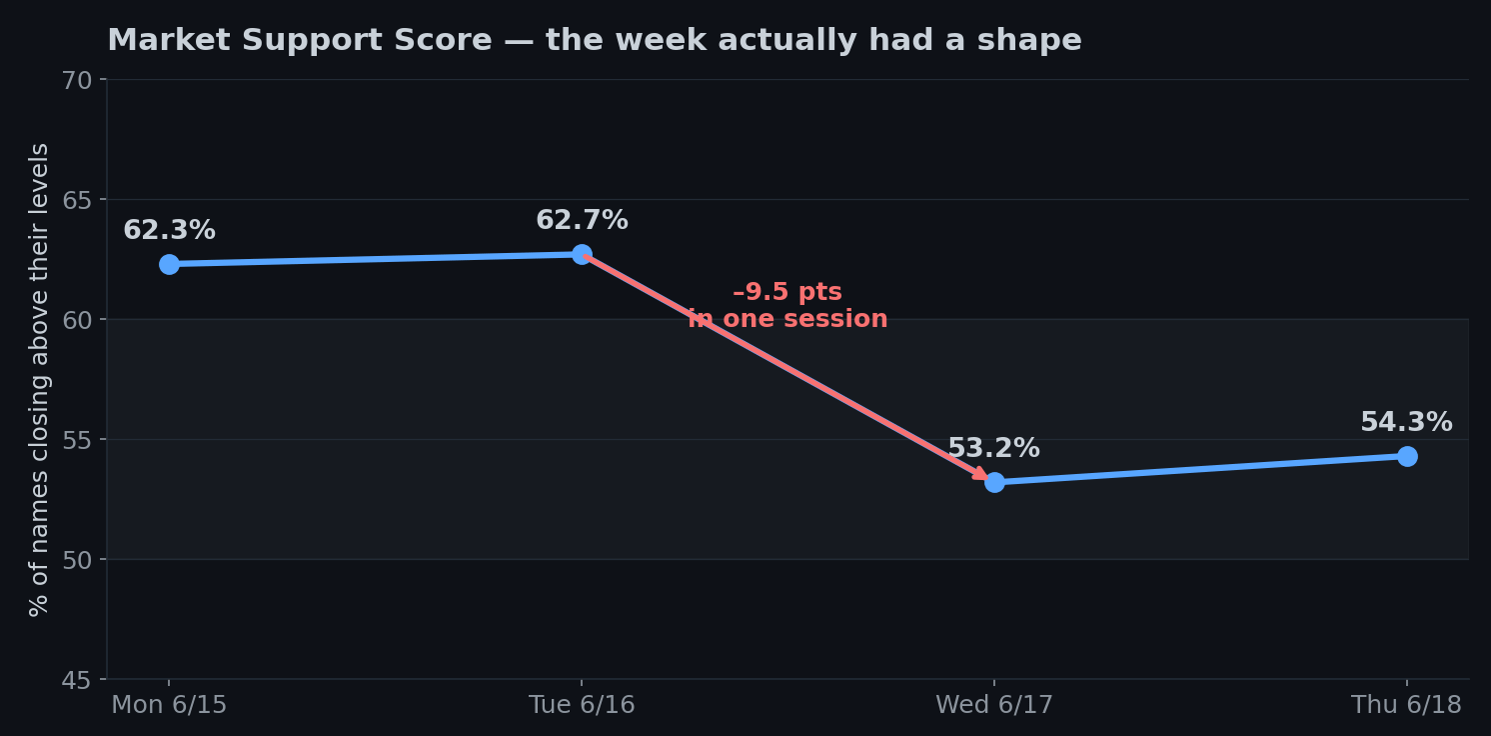
Support held at ~62% Monday and Tuesday, then fell almost ten points on Wednesday — to 53.2% — and stabilized at 54.3% Thursday. The Fed didn’t just nudge the market; it knocked roughly one in ten stocks back below the prices institutions had been defending, in a single afternoon. A Friday-only glance would’ve shown you “54%, kind of soft” and told you none of this. The path tells you the market was fine until the exact moment the Fed changed the subject from oil to rates.
But the headline number falling is the boring half of the insight. The half that pays you is which stocks fell.
It wasn’t a sell-off. It was a sorting.
When the support score drops nine points, the natural assumption is “everything went down.” It didn’t. Look at what actually happened underneath.
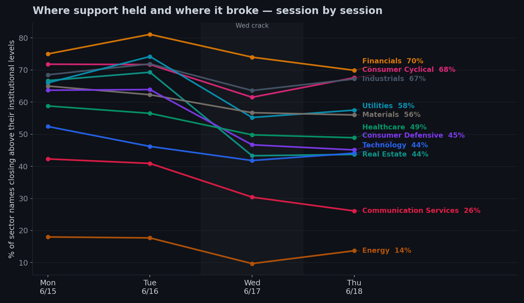
The names that broke were almost entirely the rate-sensitive bond-proxies. Real Estate fell off a cliff — from 67% of its names supported down to 44%, a 23-point collapse. Consumer Defensive — the classic safety trade — lost 19 points. Utilities, Healthcare, the dividend-payers people hide in when they’re nervous: all hit hard.
And the names that held? The cyclicals. Financials barely flinched (and actually like higher rates). Industrials lost a single point. Consumer Cyclical held up fine. These are the economically-sensitive sectors — the ones that do well when the economy is strong enough to make the Fed worry about inflation in the first place.
Read those two lists back to back and the whole move snaps into focus. This wasn’t fear. A frightened market sells its cyclicals and runs to its defensives. This market did the exact opposite — it dumped the bond-proxies and kept the economically-sensitive stuff. That’s not “risk-off.” That’s the market repricing for higher-for-longer rates with a still-solid economy underneath — which, not coincidentally, is precisely the world the Fed just told everyone it lives in. The tape and the macro are telling the same story. I just have the version you can see at the individual-stock level.
There’s a cleaner way to watch the rotation itself, by rank rather than raw score:
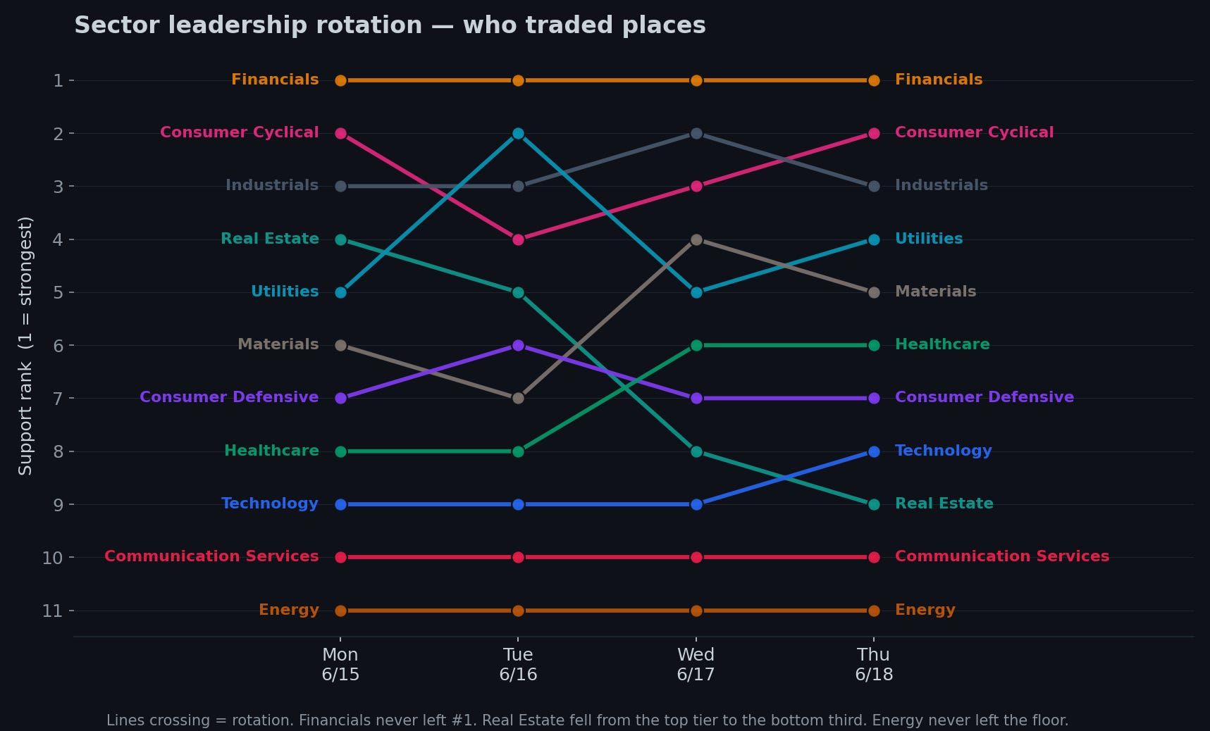
Financials never gave up first place all week. Real Estate slid from the top tier down into the bottom third. Energy never once left the floor — the weakest sector on the board every single session, oil truce or not. And one quiet detail, in the interest of honesty: Healthcare actually climbed the rankings this week — not because it got stronger (it lost ten points too) but because the sectors around it fell faster. It’s the best house on a flooding street. That’s defensive out-performance, not strength, and it’s exactly the sort of thing the rank chart will fool you on if you don’t hold it next to the raw numbers.
The one mechanical truth that ties it together
One more chart, because it explains why this framework works at all.
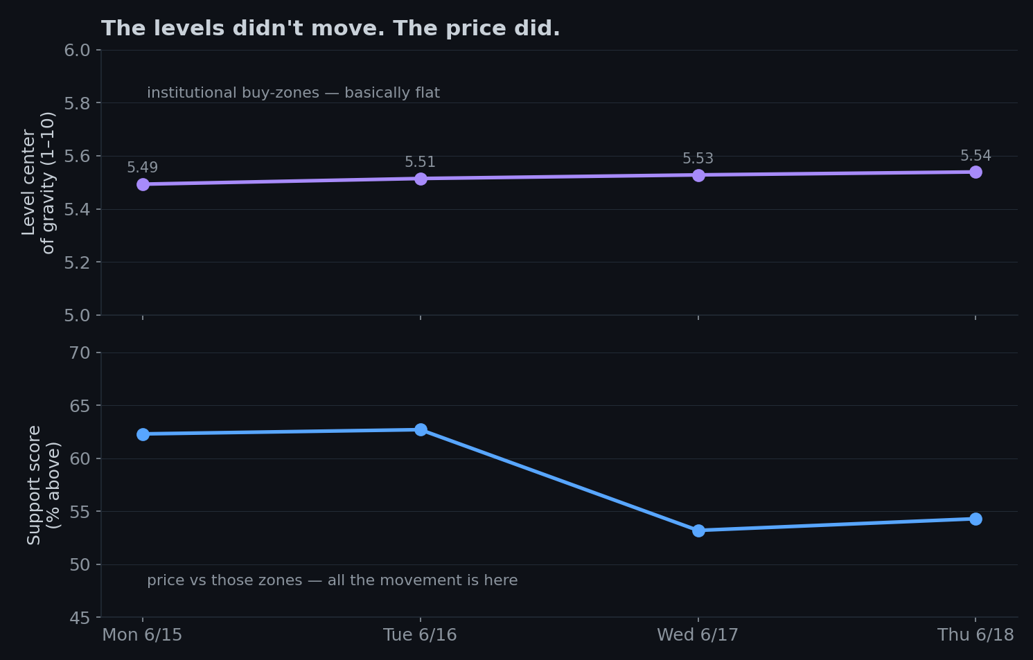
The top line is where the institutional buy-zones sat all week…basically telling us if institutions repositioned at new price locations. It’s essentially flat — those prices didn’t move. The bottom line is the support score, which fell off a ledge. Same week, totally different lines. And the gap between them is the entire point: the levels didn’t move, price did. The institutional lattice — the prices where big money has historically transacted — is the slow, stable thing. Price is the fast thing that oscillates around it. So when support craters in an afternoon, it’s not that the buy-zones vanished. It’s that price stepped away from them.
Which reframes next week into a single, clean question: does price get bought, like it has before — or do the levels finally give way and the trend actually turns? Everything I’m watching reduces to that.
What the sector averages hide
Quick detour, because it’s the difference between a useful takeaway and an expensive one.
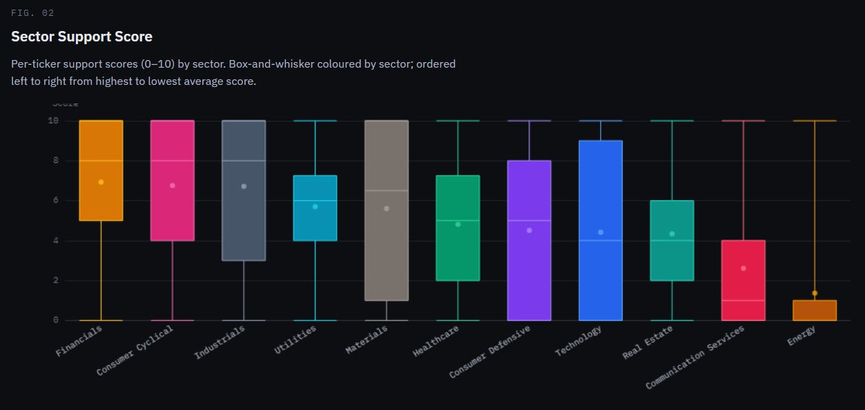
Each colored box is one sector. The dot is the average support score, 0 to 10. The fat part of the box is where the broad middle of that sector's stocks live, and the thin whiskers run down to the broken names and up to the strong ones. Sectors are lined up best-to-worst, left to right. So your eye should do two things: read the dots left-to-right to see the ranking, and read the height of each box to see how much the stocks inside agree with each other.
The ranking itself just confirms the week: Financials, Consumer Cyclical, and Industrials anchoring the left; Real Estate, Comm Services, and Energy stranded on the right. That's the rotation, frozen at Thursday's close. Nothing new there.
Everything above is sector averages — and averages, in markets as in life, are forever being quietly ruined by a few outliers. Crack open the sectors and the spread inside each one is faintly ridiculous. Technology this week is the poster child: as a group it’s slumped near the bottom of the table, the sector everyone’s busy writing off — and yet a quarter of its names are stone-cold broken, sitting on zero support, while another quarter are riding high at 9 out of 10. The same sector, at the same moment, holds both the healthiest and the most broken stocks on the board. It’s less a “sector” than a crowded room where half the people are at a party and the other half are at a funeral, and someone walked in, took the average mood, and reported it as the weather.
Energy is the one genuinely lopsided box. It’s not just low — it’s compressed at the bottom, most of its names clustered down near zero with barely any spread. That’s different from the others. A tall box says “this sector is an argument.” Energy’s short, floor-hugging box says “this sector is a consensus” — and the consensus is nobody home. When everyone agrees that completely, it’s worth at least asking who’s left to sell.
Technology and Consumer Defensive are the widest arguments on the board. Both boxes span almost the entire range — a quarter of their names broken, a quarter maxed out. These are the two sectors where “the sector” tells you almost nothing and the name tells you everything. If you’re going to do single-stock work this week, that’s where it pays the most, because that’s where the averages are hiding the most.
The practical consequence is simple and a little deflating: which names you own matters more than which sector you own. The strong sectors are stuffed with broken stocks; the weak ones are hiding genuinely strong ones. Pleasant as it would be if the market sorted itself into tidy green and red buckets you could buy by the bucket, it stubbornly refuses to. “Buy Financials, avoid Tech” is the bumper sticker. The actual signal lives one floor down, at the name. So the read-through to next week is simple: trade the rotation at the sector level for direction, but let the prints at the individual levels pick the actual names — because this chart is proof that the sector label is the beginning of the work, not the end of it.
Where the floors actually are
I’ll leave the structure with my favorite map — the dark-pool volume profiles for the four major indices. If the support score is price vs. the lattice, this is the lattice itself, drawn in dollars. And there are a lot of dollars: the four charts together map close to a trillion of them, transacted in the dark over the past few months — which is a genuinely strange sentence to be able to write, and one I recommend never fully getting over.
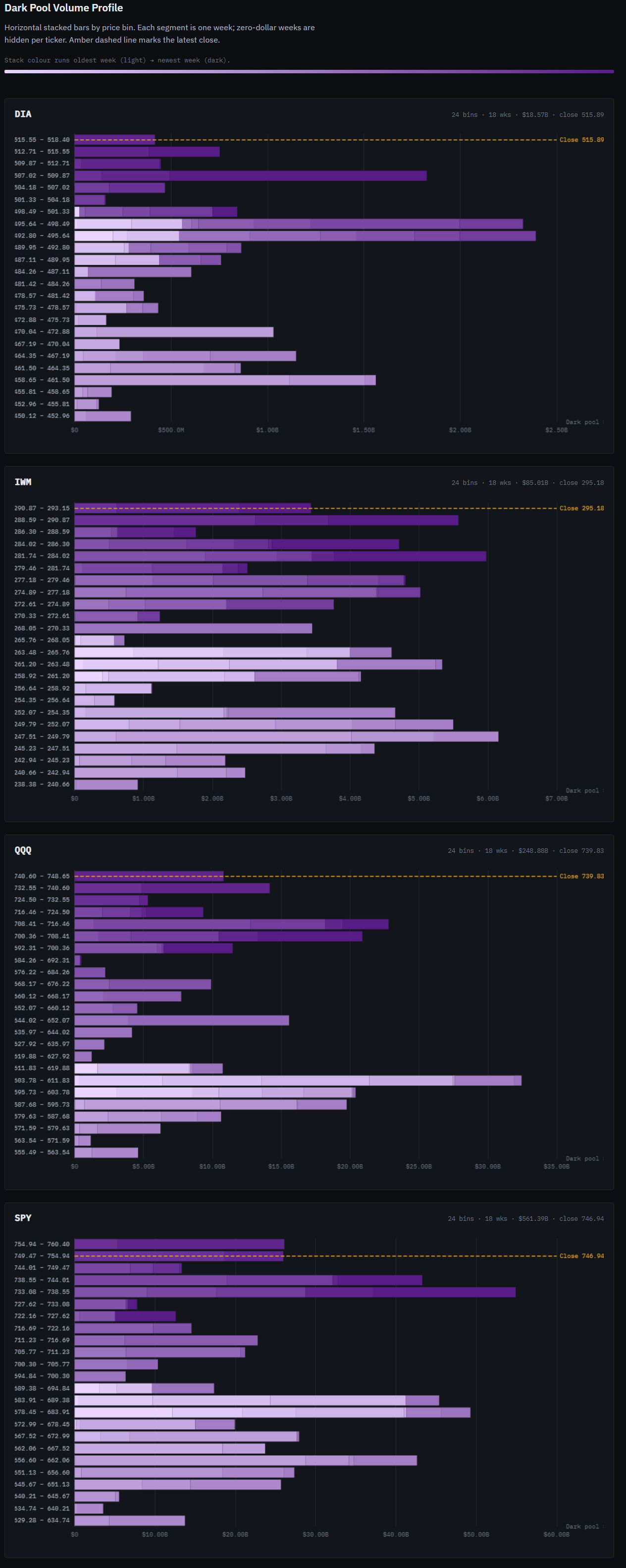
Quick read, because it looks busier than it is. Each row is a price band; the length of the bar is how much money quietly changed hands — off-exchange, away from the screen — at that price; and the bars are shaded by when: pale for months ago, dark for recent. So a long dark bar is a fresh shelf, a price where big money has been doing real business lately. The yellow line is the latest close.
Here’s what matters this week: in all four indices, the heaviest recent shelves are sitting below the current price — not overhead. The S&P’s biggest fresh shelf is parked around 733–739, and even after Wednesday’s wobble nudged price down toward it, the index closed the week above it and bounced off. Same story for the Nasdaq. Small caps actually firmed into Thursday while everything else sulked. In plain English: the floors are beneath price, not above it. The relief-rally buying didn’t pack up and leave when the Fed spoke — it’s still down there, quietly, holding up the floorboards.
One honest caveat, because it keeps you (and me) credible: a volume shelf shows where the business happened, not who won it. A fat bar means a lot of money changed hands at that price — it doesn’t, by itself, prove it was buying. What makes the read constructive is the combination: price sitting above those fresh shelves rather than below them. If next week price drops through the S&P’s 733–739 shelf instead of bouncing off it, the floor just became the trapdoor, and you can now treat that level as resistance.
And then OpEx happened
Here’s the part that recontextualizes the whole week.
Everything up to here — the calm Monday, the Fed crack, the bond-proxies breaking while the cyclicals dug in — was the market quietly forming a view. Thursday was the day it acted on that view, and it acted at a scale I don’t believe we’ve seen before.
Most days this year, institutional liquidity runs somewhere between $150 and $270 billion. Thursday it hit $899 billion — the largest single day I’ve got on record, ever.
A quick word, because this is the kind of market plumbing that sounds arcane and absolutely isn’t. Four times a year, a huge batch of options and futures contracts all expire on the same day — the wonderfully named “quad-witching” — and a mountain of positions has to be closed, rolled, or reopened at once. It’s the single most concentrated liquidity event on the calendar. Normally it’s the third Friday; this quarter, because Juneteenth shut the market that Friday, the whole circus got pulled forward to Thursday.
On the surface, Thursday looked like a gentle stabilization — support ticked up a single point, 53.2% to 54.3%, the sort of move you’d shrug at. Underneath that shrug, close to nine hundred billion dollars changed hands. The surface barely rippled while the plumbing roared. That gap — placid tape, record turnover — is the texture of institutions using a known liquidity window to reposition in size without shoving price around.
A large slice of $899 billion on a quad-witching day is plumbing, not conviction — contracts rolling to the next expiry, index funds rebalancing, and this particular Thursday, the Nasdaq-100 reconstitution dragging money into the five names joining the index next week (ALAB, CRWV, NBIS, RKLB and TER all lit up the tape — and all five are about to become index members, which means every fund that tracks the index has to own them). Some of that liquidity on Thursday was a statement. A lot of it was just the machine doing its quarterly housekeeping.
But strip the housekeeping out, and the shape of what’s left rhymes with everything else this week. Two things stand up and wave.
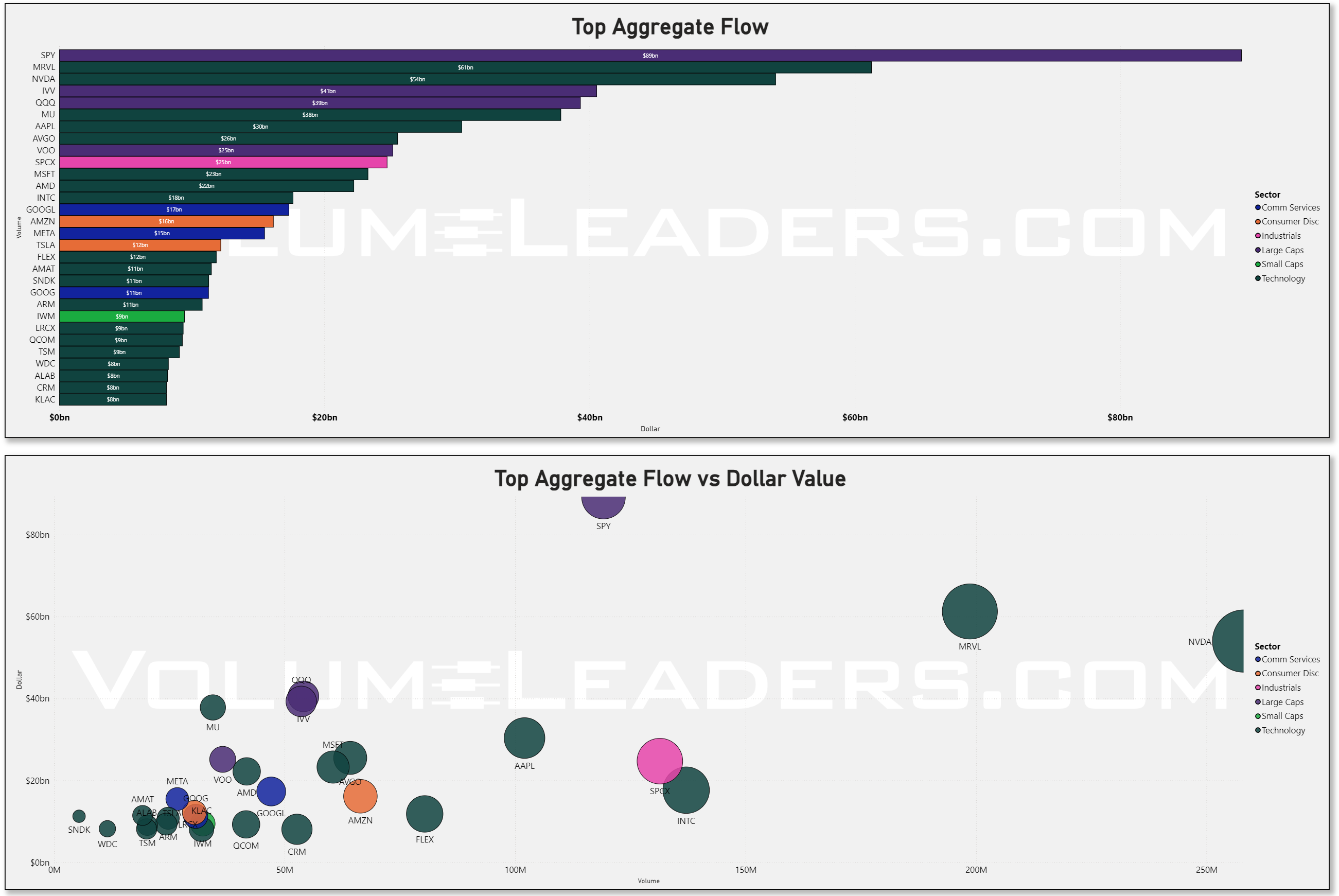
The semiconductors got bought in the dark, in real size. Marvell printed $61 billion in aggregate flow — second only to the entire S&P 500 ETF, and more than NVIDIA — with $21 billion of it crossing in the dark pools, which ranks it above NVIDIA there too. NVIDIA ($54bn), Micron, AMD, Broadcom all stacked up right behind. Now hold that against the support data, which says tech is still trading below its institutional levels. So here’s the biggest money of the year’s biggest liquidity day, quietly loading up on the one sector that hasn’t recovered yet — under cover of an event noisy enough to hide in. That’s the “building it down here” signature, at scale, with an alibi.
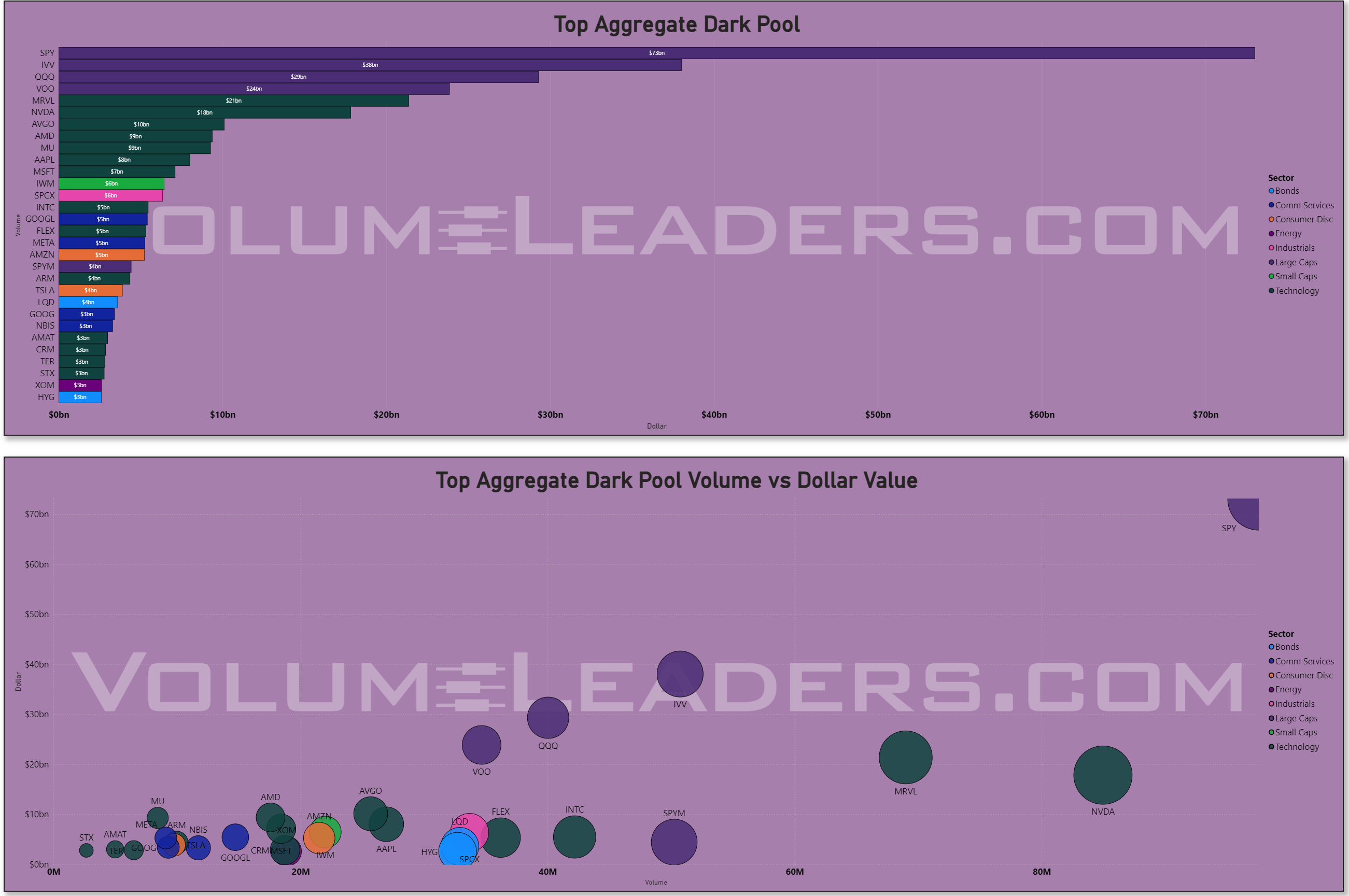
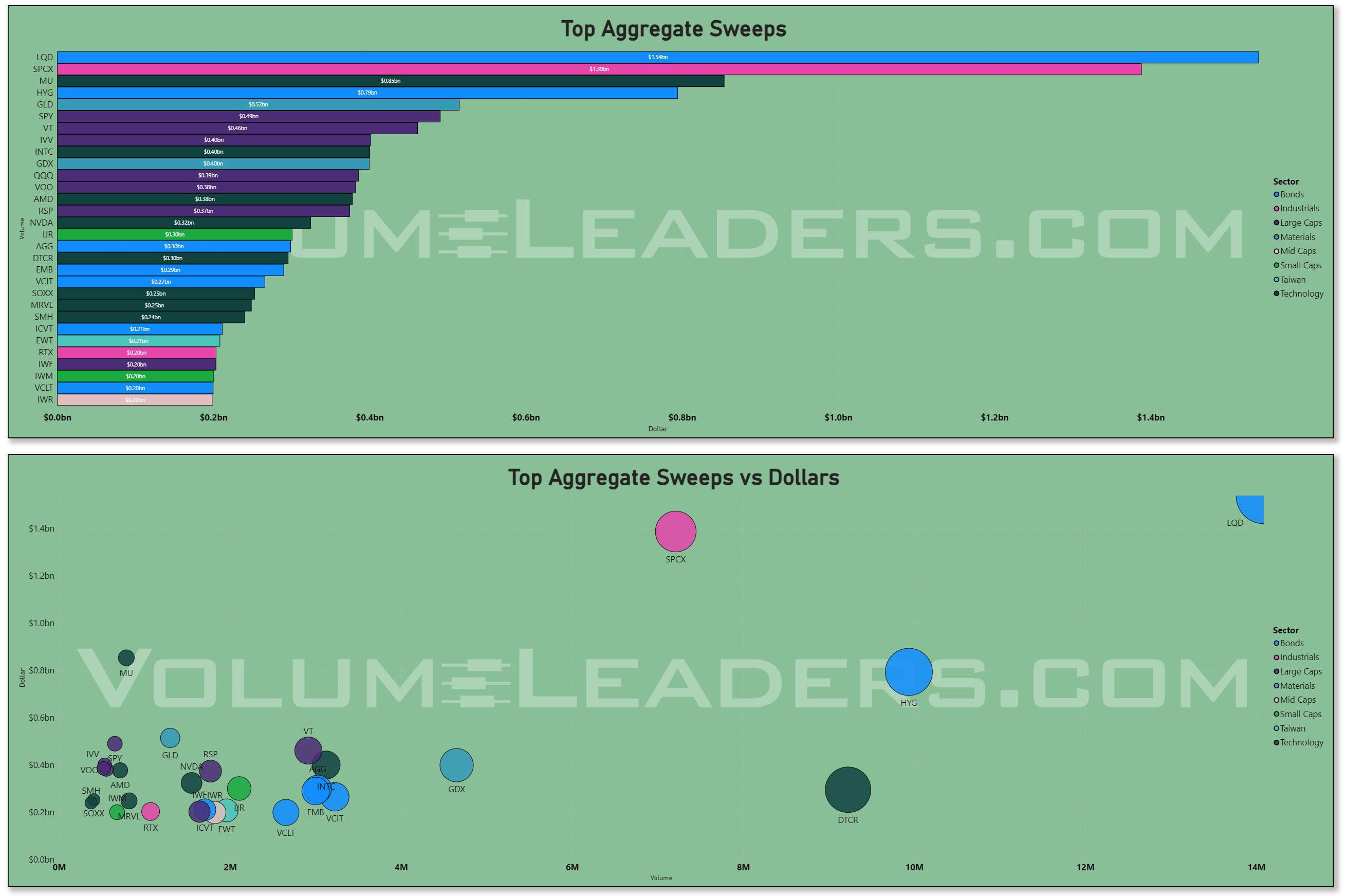
And the most aggressive buying of the day wasn’t in stocks at all — it was in bonds. Sweeps — the impatient, take-it-now orders — topped out in credit: investment-grade (LQD, $1.54 billion) and high-yield (HYG, $0.79 billion) led the entire board. On the very week the Fed shoved yields up and sent the bond-proxies running, somebody was sweeping corporate credit with both hands. Part of that is roll, sure. But the urgency is real, and it’s the single most surprising thing in the data this week. I don’t have a clean answer for it — so I’m filing it as a question worth watching rather than dressing it up as a thesis.
Where I’m watching for prints next week
Here’s the actionable part — where the structure says the interesting institutional activity should show up.
The bond-proxies are where the prints will tell the truth. Real Estate and Consumer Defensive just got dragged 20-odd points below where they started the week. Either institutions step in near their levels and defend them — and you’ll see it in the dark pools and the block prints in the VL platform before price confirms — or the levels break and these sectors keep bleeding. Watch Real Estate especially: it has the furthest to fall and the most room to snap back, so whichever way size leans there will be loud.
Financials are the tell for whether the rotation has legs. They held #1 all week and they structurally benefit from higher-for-longer. If next week’s prints keep accumulating in the banks while the bond-proxies keep leaking, the rotation is real and tradeable. If the financial bid quietly disappears, the “strong economy” read is on thinner ice than it looks.
Energy is the contrarian’s question. Dead last all week, oil truce notwithstanding — which is exactly the kind of universal disgust that sometimes precedes a turn. I’m not calling one. But it’s the one sector where a single fat, against-the-tape print would be genuinely informative, because nobody is positioned for it.
The follow-through on Thursday’s two tells. OpEx gave institutions cover to do two interesting things — accumulate semis in the dark while they’re below their levels, and sweep credit hard into a rising-yield week. The question next week is whether either was a real view or just the calendar talking. If Marvell and the semis start reclaiming their levels, the dark-pool buying was conviction. If the credit sweeps keep coming once the roll is behind us, somebody genuinely wants bonds here. Two clean things to watch, both falsifiable.
What this means for you, depending on your clock
I’ll close with the part the disclaimers usually swallow whole — but I’ll keep it honest, because the right answer here genuinely depends on your time horizon, not on what makes for a punchier newsletter.
If you trade in days to weeks: the rotation is the trade. Strength is in cyclicals and financials; weakness is in the rate-sensitive bond-proxies. Buying the dip in Real Estate or utilities here means betting against the tape and against a Fed that just looked you in the eye and crossed “rate cut” off the menu. You’re allowed to take that bet. Just know you’re swimming upstream — and let the prints at the levels, not your own hope, be the thing that tells you when size has decided to disagree with the trend.
If you invest in months or longer: most of this week is noise, and you have my blessing to ignore it. Your signal is duration. A Fed that deleted its own rate cut and is now openly arguing about hikes is telling you — about as plainly as the Fed ever tells you anything — that the reach-for-yield trade carries more risk than it did a month ago. That doesn’t mean dump your real estate and your dividend payers in a panic. It means don’t go adding to them on the assumption that falling rates will ride to the rescue, because the people who decide where rates go just quietly took that assumption off the table. Higher-for-longer pays you for quality and earnings, not for yield-substitutes — and the grown-up money, both per the strategists and per my tape, is already leaning that way.
Good luck out there this week. Wishing you clear opportunities, the patience to let the murky ones pass, and the discipline to watch what the money does instead of what the headlines say.
Thank you for being part of this community and for investing your time in this week’s edition. The quality of this readership — thoughtful, disciplined, engaged — is what makes this work meaningful. I’m grateful to build alongside you. Here’s to a week of clarity, conviction, and well-executed opportunities.
— VolumeLeaders